[css] 마우스 효과 디지인 (원모양 보이기)
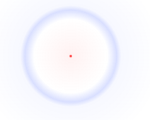
마우스 주변에 원을 생성
css
:root {
/* cursor: none; */
--cursorX: -500px;
--cursorY: -500px;
}
:root:before {
content: '';
display: block;
width: 100%;
height: 100%;
position: fixed;
pointer-events: none;
z-index: 999999;
background: radial-gradient(
circle 10vmax at var(--cursorX) var(--cursorY),
rgba(255,0,0,1) 0%,
rgba(255,0,0,.05) 2%,
rgba(255,255,255,.1) 40%,
rgba(0,40,255,.15) 50%,
rgba(0,40,255,.03) 55%,
rgba(0,0,0,0) 100%
)
}
javascript
function update(e){
var x = e.clientX || e.touches[0].clientX;
var y = e.clientY || e.touches[0].clientY;
document.documentElement.style.setProperty('--cursorX', x + 'px');
document.documentElement.style.setProperty('--cursorY', y + 'px');
}
document.addEventListener('mousemove',update,false);
document.addEventListener('touchmove',update,false);
document.addEventListener('mousedown',update,false);
마우스 중심으로 화면전체 십자가 표시
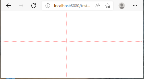
css
#cross-h {
width: 100%;
}
#cross-v {
height: 100%;
}
.e-cur {
position: fixed;
top: 0;
left: 0;
margin-top: -3px;
margin-left: -3px;
background: transparent;
border-top: 2px dotted #F005;
border-left: 2px dotted #F005;
pointer-events: none;
z-index: 99999;
}
javascript
// 여기선 jQuery 사용
$("body").append("<div id='cross-h' class='e-cur'></div><div id='cross-v' class='e-cur'></div>");
let gcrossH = document.getElementById("cross-h");
let gcrossV = document.getElementById("cross-v");
function update(e){
gcrossH.style.top = e.pageY+"px";
gcrossV.style.left = e.pageX+"px";
e.stopPropagation();
}
document.addEventListener('mousemove',update,false);
document.addEventListener('touchmove',update,false);
document.addEventListener('mousedown',update,false);