[css] 버튼만들기
버튼 꾸미기
※ 여러가지 참조 w3schools.com Click here !!!
닫기버튼
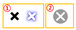
①번 꾸미기
.btnx {
width: 30px;
height: 30px;
display: inline-block;
position: relative;
transform: rotate(0deg);
transition: transform 300ms;
}
.btnx:hover {
transform: rotate(180deg);
cursor:pointer;
color: white;
text-shadow: 1px 1px 2px black, 0 0 25px blue, 0 0 5px darkblue;
}
.cell {
text-align : center;
position: absolute;
top: 50%;
left: 50%;
transform: translate(-50%, -50%);
font-size: 36px;
font-weight: bold;
}
<div class="btnx">
<div class="cell">×</div>
</div>
.btnx {
width: 30px; height: 30px;
display: inline-block;
position: relative;
outline: 2px solid #AAA;
}
.cell:hover {
transform: translate(-50%, -50%) rotate(180deg);
cursor:pointer;
color: white;
text-shadow: 1px 1px 2px black, 0 0 25px blue, 0 0 5px darkblue;
}
.cell {
text-align : center;
position: absolute;
top: 50%;
left: 50%;
color: #AAA;
font-size: 44px;
font-weight: bold;
transform: translate(-50%, -50%) rotate(0deg);
transition: transform 300ms;
}
②번 꾸미기
.btn_close {
display: inline-block;
width:50px;
height:50px;
background:#999;
border-radius:50%;
position: relative;
transition: transform 300ms;
transform: rotate(45deg);
}
.btn_close::before {
content: '';
position: absolute;
height: 6px;
width: 40px;
border-radius: 6px;
background: white;
top: calc(50% - 3px);
left: 5px;
}
.btn_close::after {
content: '';
position: absolute;
height: 40px;
width: 6px;
border-radius: 6px;
background: white;
left: calc(50% - 3px);
top: 5px;
}
.btn_close:hover {
transform: rotate(225deg);
}
<div class="btn_close"></div>